User Interfacing could arguably seen as one of the most important things to get right, regardless of the quality of the game, if the player cannot see where they stand or have no clue of their abilities, then it could all be void.
I believe it was John Bain (better known as TotalBiscuit) who commented that even the highest quality of titles could be ruined by a poorly made inference, this can be either be the way it looks from an aesthetic standpoint, how it displays its information, its layout and of course how well it works.
As games become more complicated, the need for a better user interface grows.
Of course the classic interface was perfect for the time, which is a lives meter and maybe how many coins you’ve picked up.
 |
Interfaces for the most part are detached from the world, as in meaning while you the player can see them, the character in the world would never see it.
This might seem obvious in a case like World of Warcraft or Dragon age where there’s mini-maps, icons, bars and the sort which naturally the character would never be able to see.
However that’s not to say it can’t be done otherwise, Halo can easily do this.
As every single player able character in Halo (with the exception of the Elite’s, but let us pretend they don’t exist for a moment) is wearing a helmet with the HUD inside.
Meaning that the player is getting all the information they need (ammo, health, mini-map, objectives, ect.), but at the same time this is also what the character is seeing. In this case, you can truly pretend to be the Master Chief or random online Spartan as you’re sharing the same sight.
 |
| Be one with the Chief. |
But that isn’t the only way, a rather ingenious interface can be found as part of EA's 'survival horror' series Dead Space, a third person game where the backpack of the character is actually the health meter, what makes this fantastic is that this is part of the world of the game.
While maybe Isaac himself might not be able to see it, if say somebody else was standing behind him, then that person would be able to see Isaac’s health.
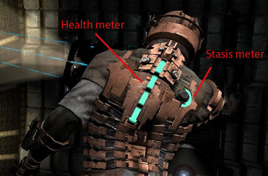 |
| Image produced by Gamasutra |
I personally think the now defunct Warhammer Online: Age of Reckoning’s UI, while still following the classic MMO standard popularised by WoW (which itself at the time was considered revolutionary for making the UI more slim-line in comparison to previous MMOs, such as Asheron's Call), did a much nicer job due to not just making the UI more visually pleasing, but condensing the information down into more manageable chunks.
 |
| There's a reason why EVE has been called a "Spread Sheet Simulator", UI is one of them. |
The key to a good User Interface ultimately is that player shouldn't need to think about it too much, they shouldn't have to be digging around to find the information they need.
That at a glance they can tell what it is they need to know, maybe the bitter-sweet truth of a good UI is, that it isn't even noticed at all.
RESEARCH AND DEAD SPACE IMAGE FOUND AT GAMASUTRA ->
http://www.gamasutra.com/view/feature/4286/game_ui_discoveries_what_players_.php?print=1
No comments:
Post a Comment